Best start with two caveats.
First, yes, planes sometimes do crash. And second, there’s lots of reasons why they mostly don’t.
I recently discovered a simple human design factor that contributes to aircraft safety—and realised I could borrow the same idea for the user interface design in my home automation.
What are my odds?
It’s often said that commercial air travel is one of the safest things you can do; but it’s so incredibly safe that the odds are hard to comprehend. If you took a commercial jet airliner flight in 2022, your chance of a fatal crash was 1 in 5.8 million^1.
It’s 1 in 5.8 million because only 1 jet crashed from a total of 5.8 million flights. There’s no such thing as “half a jet,” so it’s pretty hard to get much lower than that. Other than absolutely zero. (Mathematicians: you can start reading again now.)
People problems
Aircraft safety isn’t just from good engineering or technology. The biggest risk is the people operating the aircraft, and that’s why commercial flying is so safe: iteratively honing the human processes to the point where they’re near-infallible.
Added to this, very few airliner crashes are due to a single factor. Usually two things have to go wrong at the same time^2. Perhaps a smaller initial issue distracts the pilot from a secondary one. The distraction means that their situational awareness becomes reduced.
How do you improve situational awareness? Let’s think about the simplest electronic device in an aircraft: plain old switches.
Switching mindset
Switches are really simple: something’s either On or Not. What’s to go wrong?

Obviously the complexity comes from the quantity of switches. It’s easy to spot that one switch is “On” where it should be “Off”. If there are hundreds, then less so.
This challenge was addressed by the European aerospace manufacturer, Airbus. They have pioneered a principle to make hundreds of switches simpler for a pilot to understand. It’s called “Dark Cockpit,” and we can demonstrate it here.
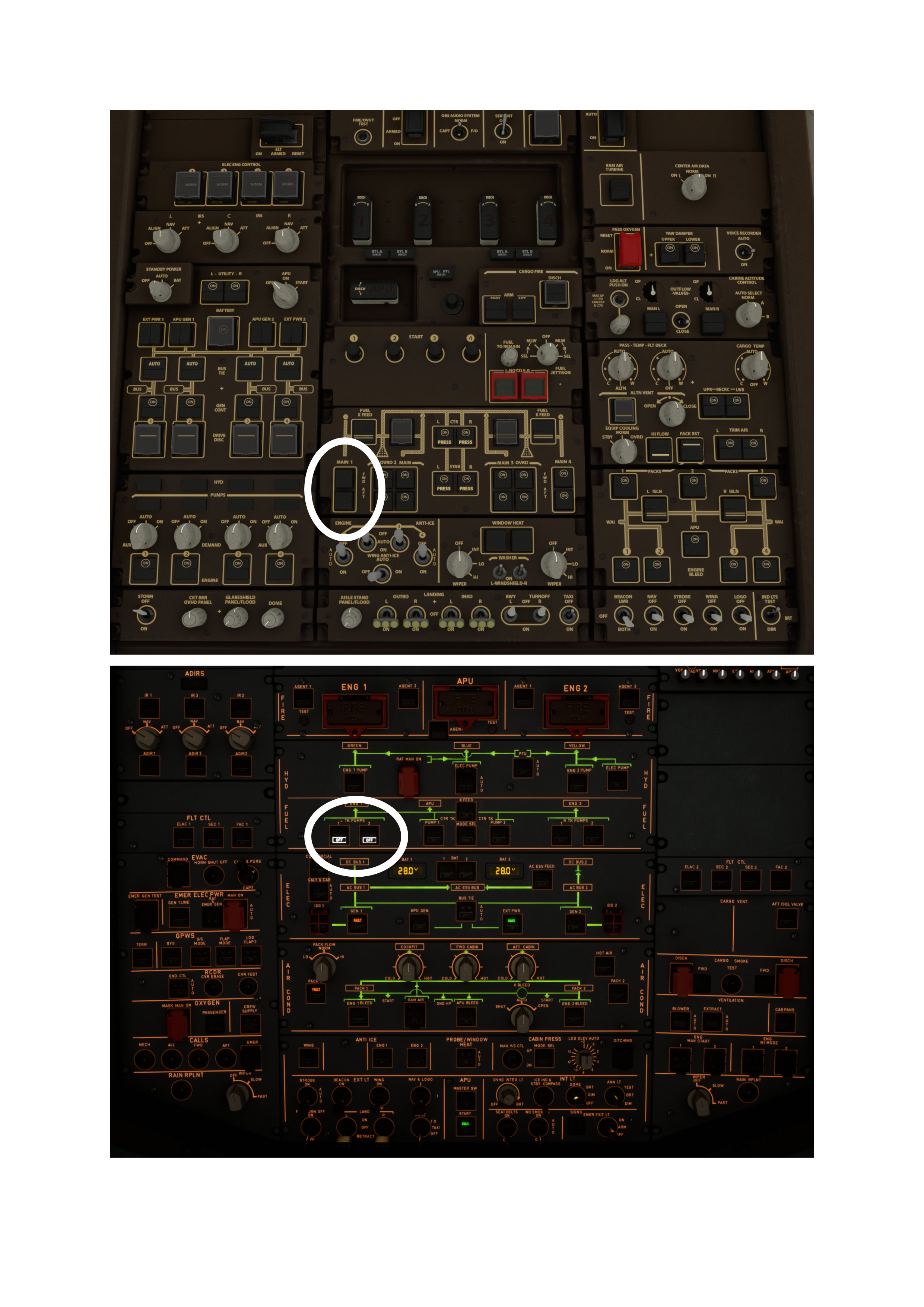
First, let’s look at some cockpit switches from the other big name in airliner manufacturer—the one everyone’s heard of. I’ve deliberately set some of these switches incorrectly. Can you spot the mistake? Well no, probably not…
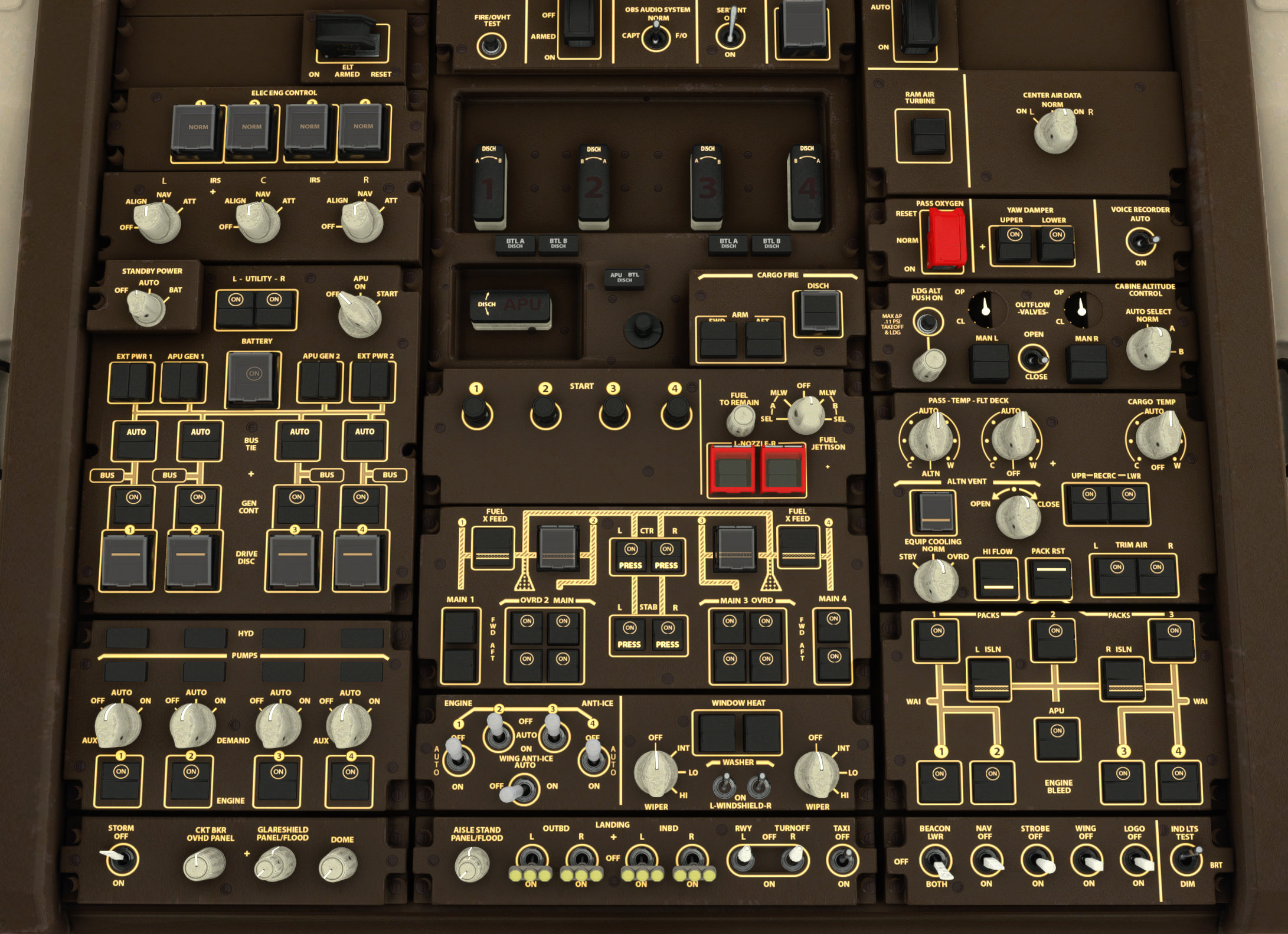
Of course a pilot will spot the mistake. But the point is, if they’re already distracted by another failure, then their situational awareness is reduced and they might not spot this.
Now let’s look at a similar invalid switch configuration, but this time in the Airbus cockpit.
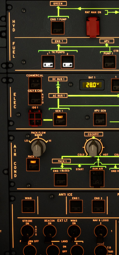
Much more easily noticed: the left “Tank Pumps” are set to OFF, which has also caused “GEN 1” and “PACK 1” to go into “FAULT” because, well, the engine has stopped. (Pilots: you can start reading again now.)
Even if you know nothing about flying this aircraft, you could have a good guess what’s not right. The “Dark Cockpit” principle^3 means that only the abnormal switches are lit up, and anything that’s in its nominal position is “dark.“
Problem #2 averted. Airbus pilot now has more situational awareness available for problem #1, whatever that was.
Here are these two opposite approaches shown together, with the relevant incorrect switch settings highlighted on the Boeing and then the Airbus. See how much easier the “Dark Cockpit” principle is.
What’s the link to Home Automation?
I hope this has persuaded you really simple changes, like changing a switch, can contribute enormously to usability. We can take those principles and apply them more widely.
In my case I’ve applied the Airbus principles to my home automation control screens. This is because it’s all getting a bit too complicated for people to run the house… It’s OK for me—usually—because I built it. But it’s becoming unintelligible for anyone else.
So now, I’ve built a control panel as per Dark Cockpit:
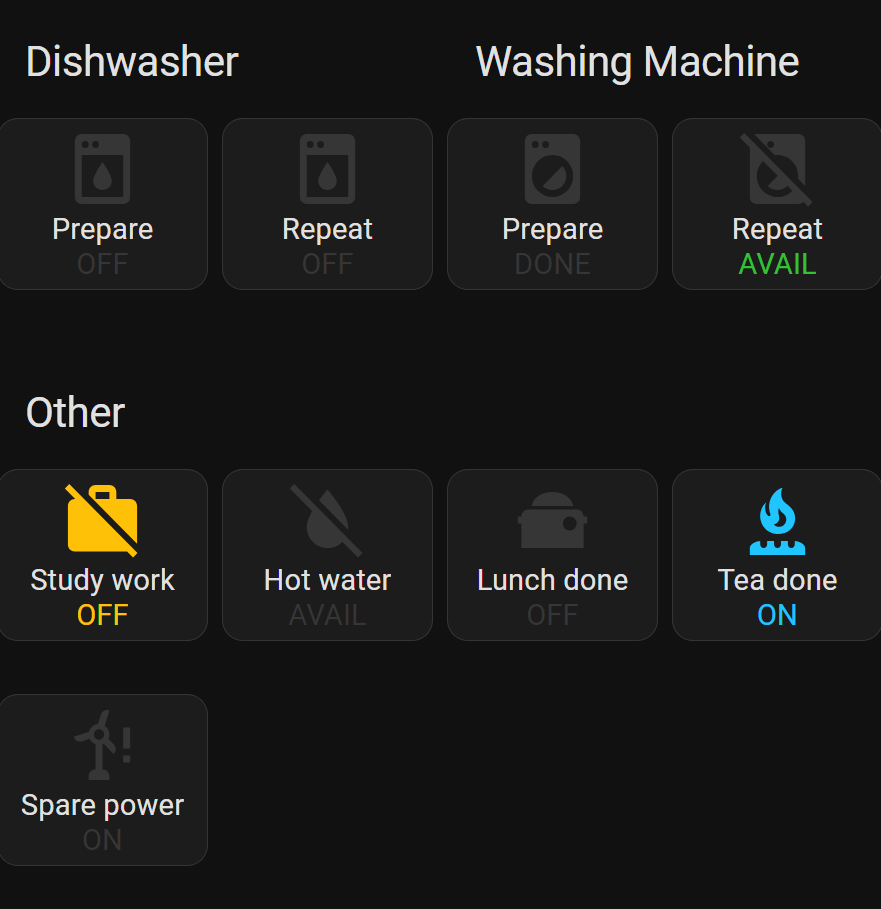
The Dark Cockpit principle means everything is always dark when it’s “normal”. Only things that require your attention are lit-up, and they follow the same design principles as Airbus too:
Yellow is where you’ve pushed a switch, but “might be of concern, so be aware of it.“
Green hints you might want to push that switch, but it’s not essential.
Blue says you’ve pushed a switch, and it will stay activated for a short period until it resets.
Dark is where it’s nominal. E.g. above, the “Spare power” mode is ON, which is the default and therefore is dark.
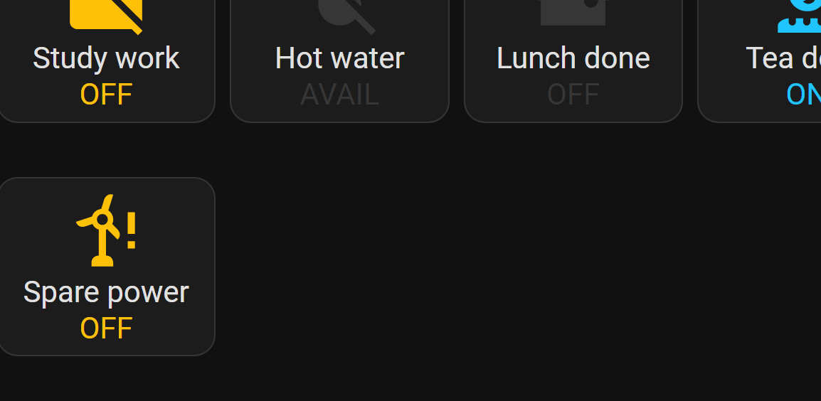
If I was to push the “Spare power” switch, I’d be disabling spare power (potentially a bad thing) and the button lights up yellow to warn me:
I’m definitely going to consider this approach when I’m developing software user interfaces, too. Airliner-spec buttons for everyone!