I’ve been doing some painting.
It’s taken 6 months—and an unreasonably broad definition of “painting”—to produce this perfect pointillism…
I can’t credit myself with any kind of creativity though: my skills in abstract art are absolute zero.
No. It’s a rendering of the skyline behind our house, painted entirely by data from solar panels. No sleight of hand; just natural beauty arising from some chance data.
If you want proof that it’s a painting of a real skyline, skip to the end for the spoiler. Or, read on…
The basics
Obviously, solar panels generate more electricity when there’s more sunlight.
Let’s represent the amount of electricity generated as coloured dots. A large orangey-red dot shows the solar panels are producing lots of electricity, meaning we have lots of sunlight. A small blue dot is less sunlight.
Most solar panels will tell you how much electricity they’re generating. In my case, I measure the electricity generation every 10 seconds or so, and squirrel that data away in case it’s useful later.
It’s about time
As well as measuring how much electricity—and therefore sunlight—I’m recording the date and time of that measurement. If you know where you are on earth, and you know the time, you can calculate the position of the Sun in the sky.
So. Our coloured dots now represent the amount of sunlight, and the position of the Sun.
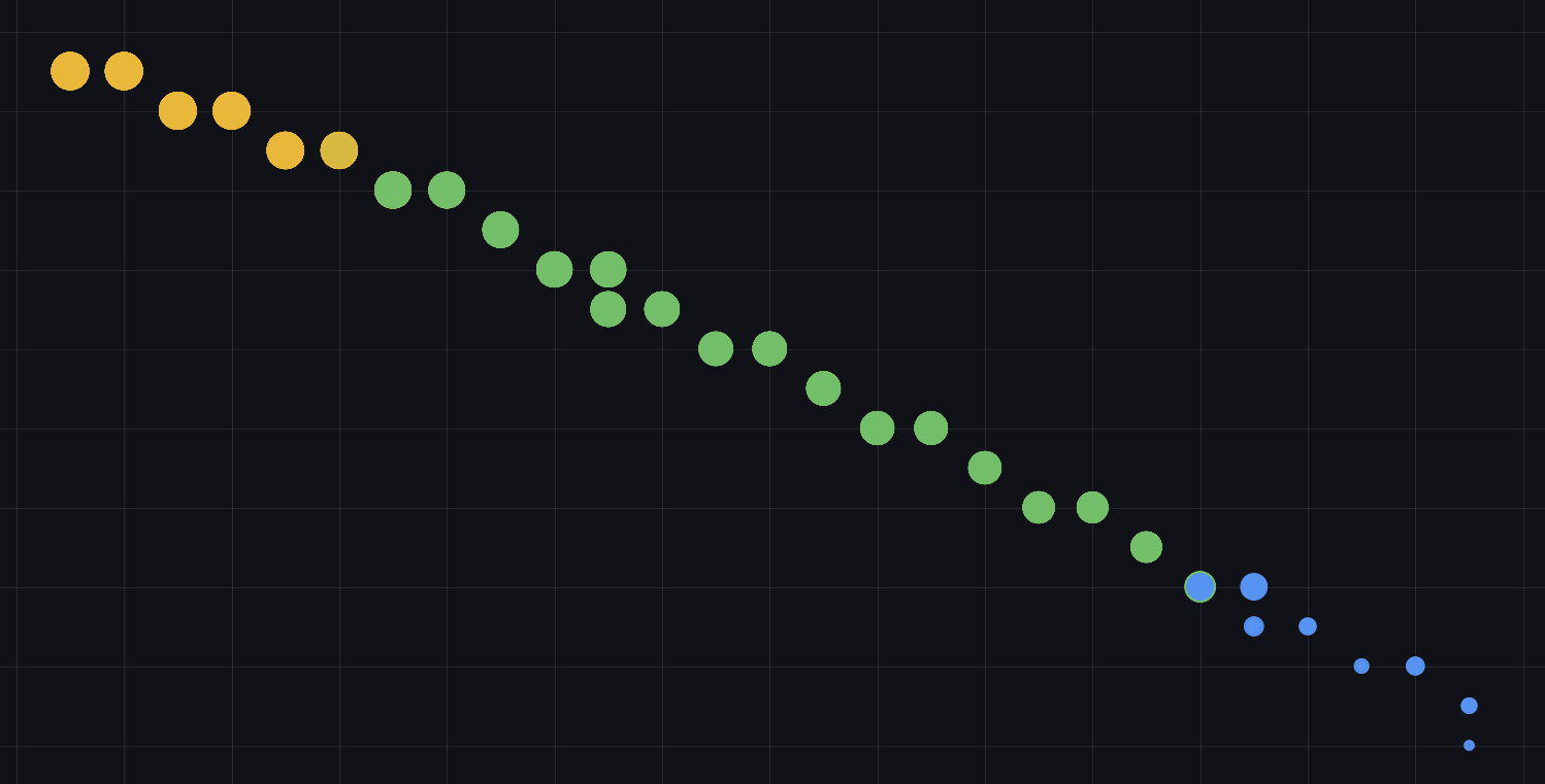
We can draw that on a graph. Here’s all those dots drawn on the first day of summer.
See how the brightest sunlight is at midday when the Sun is highest in the sky and at “180 degrees Azimuth”—or “South” as normal humans call it.
This should be familiar to most people living in the Northern Hemisphere, where the Sun is always directly South at midday (or maybe 1pm if you’re in BST/DST)
Celestial considerations
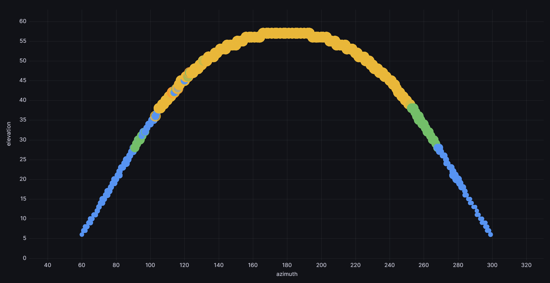
Next piece of the painting is that the Sun moves differently across the sky on each day of the year. Northern winter has the Sun tracking much lower across the sky, and higher during summertime. It’s the opposite in the Southern Hemisphere.
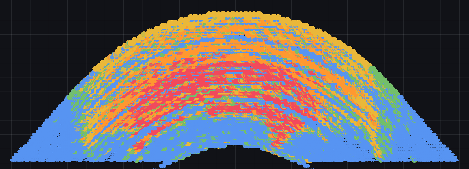
By recording our electricity data for each part of the day, on each day of the year, the data literally paints a picture of how much Sun the solar panels can “see.”
The lowdown
First, for reference, here’s a wide-angle photo of the skyline behind our house. The solar panels are directly behind us in this photo, facing the same direction.

You can tell this photo is taken from quite low down; our solar panels are mounted on a single-storey garage. It was easier than putting them on the roof of the house, with the trade-off that the Sun often dips below the other houses during winter. No worries: the Sun is always low in the sky during Northern winters, so you don’t get much solar electricity either way.
But: bonus!
The Sun pops in and out of shadow from the surrounding skyline—and the solar panels “see” this as a varying amount of electricity. Our solar panels have become a camera!
Albeit it’s taken 9 months to take 1 exposure.
Before the final reveal, here’s the data plot of that 9 months of sunlight strength as seen by the solar panels:
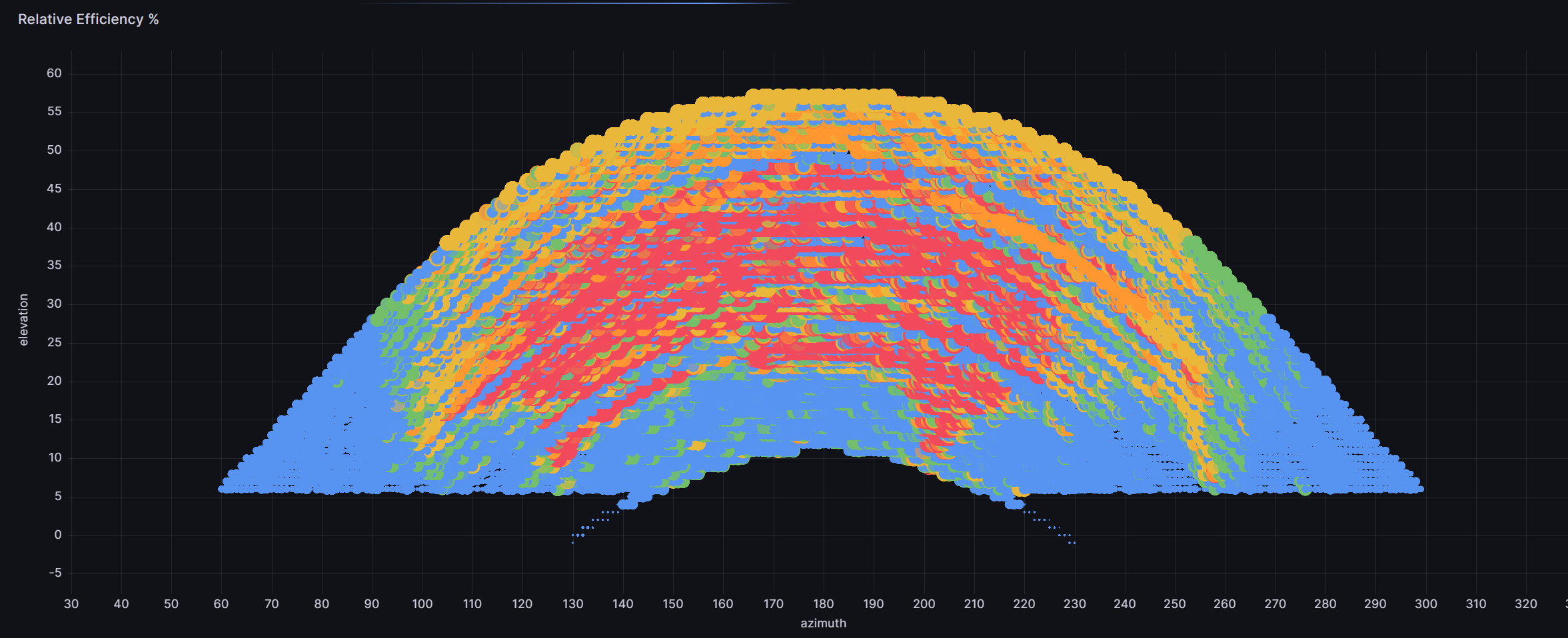
The final picture
And the final proof that data is beautiful: when laid onto the wide-angle photo, the data has traced the outline of the houses in remarkable detail.
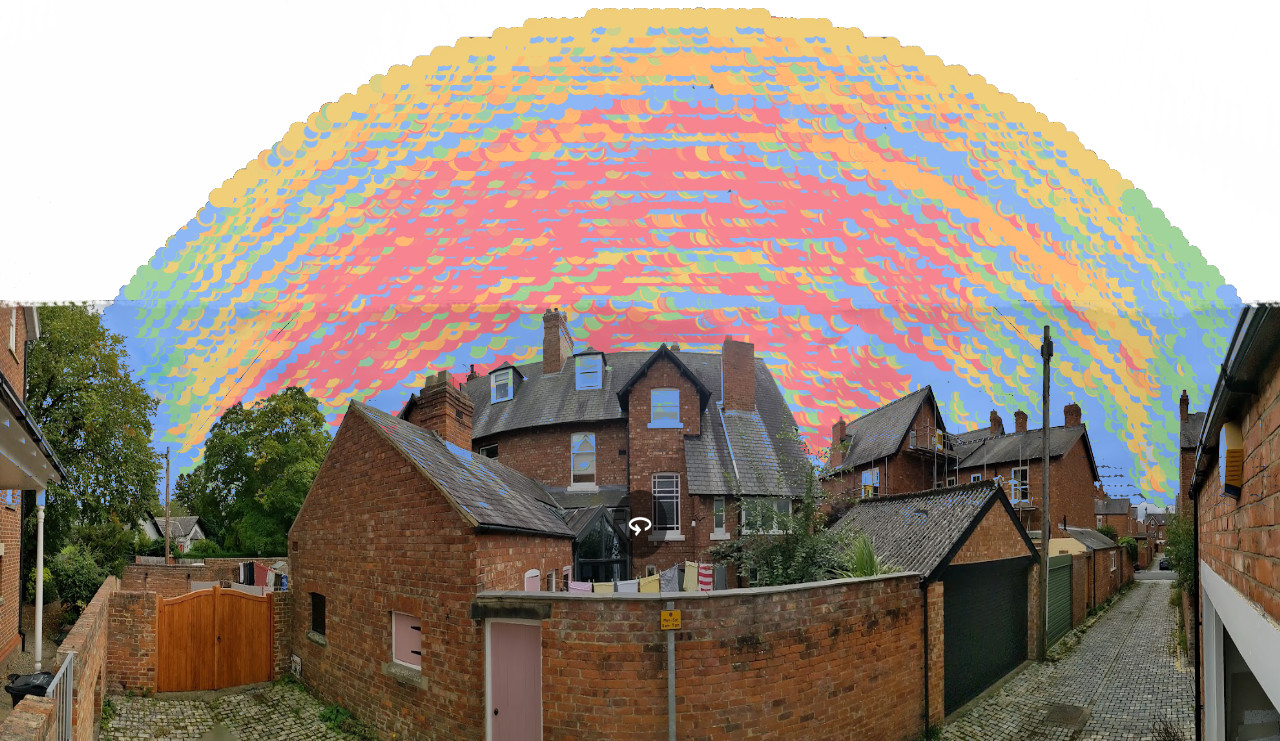
It’s striking how the “V” shape gap between the houses is strongly coloured red where the Sun pops through. Conversely the blue shadow cast by the large lime tree on the left of the picture.
Likewise looking right down the back lane, there’s a vertical sliver of yellow as the Sun briefly comes out from one row of houses, before being hidden by the next row just off-camera to the right.
So there you go. Some beautiful pointillism arising from a serendipitous set of data. Art from science!
Epilogue
This should look even better once there’s another year of data behind it. Some of the blue streaks represent cloudy days, sometimes several in a row. That’ll average-out with more data, so I’ll post again when that’s done.
And finally, for the tech nerds: