Collections, Classes, Clocks

Here’s a talk I did at a local tech meet-up event. This blog post is, unashamedly, NET 8 for the Nerds.

I was meant to be speaking about the new Microsoft .NET 8 release, but decided to be rebellious and talk lots about Python instead. Partly, my excuse was that tech meet-ups are more fun if there are different technologies.

But, struggling for a better excuse, I decided to talk about new language features that are moving C# closer towards the convenience of Python. Read on to be unconvinced.

0. Tech we’ll be using

  • .NET 8 and C# 12: new language and runtime features
  • Python: hugely convenient, can C# learn from it?
  • Jupyter Notebooks: markdown and code OK the talk used Jupyter but I can’t do that in a blog post

I’ve grouped the talk into 3 parts: Collections, Classes, Clocks.

1. Collections

Collections are the mainstay of most applications. After all, what’s ever been achieved by processing a single datapoint on its own?

Everyone has their favourite. IEnumerable<T> or IList<T> or just plain arrays. They’re a bit faffy to initialise though, aren’t they? It all depends on the method you’re calling, and what type that expects:

1
2
3
4
ProcessData(new int[] { 1, 2, 3 }); // If you're lucky.
ProcessData(new int[] { 1, 2, 3 }.ToList()); // If you're unlucky.
ProcessData(Enumerable.Empty<int>()); // Or even if you even just want to do nothing.
ProcessData(Array.Empty<int>()); // ...unless it needs an Array, in which case it's this.

This is even more of a pain if you change the method signature to a more derived type. Even your empty array calls don’t compile any more!

Before we start, let’s talk about Python!

Python rightly has a reputation for being quick to develop code. The syntax is really simple and doesn’t have any of that unnecessary faff:

1
ProcessData([1,2,3])

Can we get close to Python in .NET 8 with C# 12?

1
2
3
4
5
6
// Let's try...
ProcessData([1,2,3]);

// Or even...
int[] others = [9,8];
ProcessData([1, 2, ..others, 3]);

So yes we can! If you compare the Python example to that first C# 12 block above, you’ll see they’re literally identical.

(in fact, when I gave this talk live, I used a Jupyter notebook and ran that “Python” code sample inside a C# .NET interpreter block, because the syntax was identical. Except I hid a semicolon on the next line. I know right? What a trickster!)

So what’s going on?

A new language feature: collection expressions^1. Lots of magic under the hood. Some neat features:

  • If the target type changes (e.g. a method used to take IEnumerable but now takes Array) the compiler finds the most appropriate initialiser.
  • All sorts of performance optimisations internally; better than most people would hand-roll. Example^2

2. Classes

Let’s create a class that processes some data and returns a calculated result.

1
2
3
4
5
6
7
8
9
10
11
12
13
14
15
16
17
18
19
20
21
using MathNet.Numerics.Statistics;

public class Stats
{
public Stats(IEnumerable<double> data)
{
_data = data;
}

private readonly IEnumerable<double> _data;

public (double Average, double Deviation) Calculate()
{
return (_data.Average(), _data.StandardDeviation());
}
}


var result = new Stats([1,2,3]).Calculate();

Console.WriteLine($"{result.Average}, {result.Deviation}");

You’ll see that this takes some data, does two calculations on it (average and stdev) and returns the result.

(NB I have taken liberties here and enumerated the same IEnumerable more than once. This is usually a Bad Thing (TM) and I’ve done it for artistic license. Don’t do it in your production systems!)

Can we learn much from Python?

1
2
3
4
5
6
7
8
9
10
import statistics

class Stats:
def __init__(self, data):
self._data = data

def calculate(self):
return (statistics.mean(self._data), statistics.stdev(self._data))

avg, dev = Stats([1, 2, 3]).calculate()

So yes, Python has simplified this in a few ways:

  • Eliminated the explicit declaration of the private readonly variable for _data
  • Enables de-structuring the result directly into two variables

Let’s see what we can do with C# 12 and .NET 8

1
2
3
4
5
6
7
8
9
10
using MathNet.Numerics.Statistics;

public class Stats(IEnumerable<double> data)
{
public (double Average, double Deviation) Calculate() => (data.Average(), data.StandardDeviation());
}

var (avg, dev) = new Stats([1,2,3]).Calculate();

Console.WriteLine($"{avg}, {dev}");

Hang on. That’s shorter than the Python equivalent!

What’s going on?

Some magic syntax coming from the new C# 12 specification. We used a few recent-ish features from prior C# specifications too:

  • C# 12: Primary Constructors^3. A bit like we see in the recent record class definitions we gained in C# 10. (although record classes expose the field publicly, whereas classes with primary constructors don’t.)
  • C# 10: Destructuring of objects into variables (since C# 7 with some restrictions)
  • C# 6: Expression-bodied members

3. Clocks

To be fair I’ve dropped the Python rebellion pretence now, but I do want to talk about the most significant new feature to appear in .NET for many a long year.

Let’s talk time.

So you’re not afraid of working with time?

Time is one of the most difficult concepts in programming. Need persuading? If you live somewhere with a summertime timezone offset, just start with that. Can you think of any unsafe assumptions people typically make?

TL;DR: If you’re not Unit Testing your time calcs, your code isn’t production-ready.

What happens when we try to Unit Test our time calculations, usually? Let’s create a class that does some basic time calcs.

1
2
3
4
5
public class UntestableTimeCode()
{
private readonly DateTimeOffset _createdOn = DateTimeOffset.Now.Date;
public bool IsItTomorrowYet() => DateTimeOffset.Now.Date > _createdOn.Date;
}

Completely fictional obviously, but this code would store today’s date when you initialise it, and then you could repeatedly ask it “Is it tomorrow yet”. Until it is.

The clue’s in the name here: it’s not really testable. But if we really really had to test that class, could we do it in a hacky creative way?

1
2
3
4
5
6
7
8
9
10
11
12
13
14
15
using Xunit;

public class TimeTest1
{
[Fact]
public async Task TestIf_IsItTomorrowYet_ReturnsTrueTomorrow()
{
var untestable = new UntestableTimeCode();

// Umm...?
await Task.Delay(TimeSpan.FromHours(24));

Assert.True(untestable.IsItTomorrowYet());
}
}

…yes. But you can see the problem here. Your unit test would take 24 hours to run. FAIL.

.NET 8 secret sauce

So. We need some way to modify the system clock. Or rather, de-couple our code from the system clock, and use an abstraction that we can control in a test.

1
2
3
4
5
6
7
8
public class TestableTimeCode(TimeProvider timeProvider)
{
private readonly DateTimeOffset _createdOn = timeProvider.GetUtcNow().Date;
public bool IsItTomorrowYet() => timeProvider.GetUtcNow().Date > _createdOn.Date;
}

// In normal use, we pass the current System time provider into the constructor:
var myTimeCode = new TestableTimeCode(TimeProvider.System);

OK, so we have now de-coupled from the System clock by adding a dependency. How does this make Unit Tests possible?

1
2
3
4
5
6
7
8
9
10
11
12
13
14
15
16
using Microsoft.Extensions.Time.Testing;

public class TimeTest2
{
[Fact]
public void TestIf_IsItTomorrowYet_ReturnsTrueTomorrow()
{
var fakeTime = new FakeTimeProvider(startDateTime: DateTimeOffset.UtcNow.Date);
var untestable = new TestableTimeCode(fakeTime);

// await Task.Delay(TimeSpan.FromHours(24)); --not any more!
fakeTime.Advance(TimeSpan.FromHours(24));

Assert.True(untestable.IsItTomorrowYet());
}
}

Amazing! We can artificially advance the system clock to suit our whim.

TimeProvider is our new best friend!

Remember, take a TimeProvider dependency into all your time-based code.

You can then use FakeTimeProvider in lots of powerful ways:

  • Advance time immediately (like above)
  • Timezone changes e.g. summertime
  • Other countries’ timezones
Horizon

Why should you care?

Post Office Horizon. Another failed £1bn government IT project. So what? OK it’s a waste of money, but plus ça change?

Here’s why.

Because this failure is associated with:

  • 4,000 people falsely accused of fraud or mismanagement
  • 700 people prosecuted
  • 200 people sent to prison
  • 3 people’s deaths

I use the word “people” 4 times, deliberately. Because this is about people. The people affected; and the people responsible.

What’s Horizon?

Horizon is a £1bn IT system enabling UK Government departments to make social security payments. Development began in 1996 and lasted 20 years.

It was designed for the UK Government benefits agency and the state-owned Post Office. Post Offices are run in a franchise-like way by “Sub Postmasters” (SPMs). These are people who ran their Post Offices quietly and successfully for many years prior to Horizon.

Problems

When Horizon was rolled out to Sub Postmasters they began noticing financial errors. Money was going missing.

Important context: Horizon had already “failure[d] to meet the first milestone [which] cannot but cause concern in a project with such a chequered history”. This is a quote from the Parliamentary Select Committee report^1 in 1999. The same report tells us the UK benefits agency had pulled out of the project by 1999, leaving Post Office as sole client (and primary financier) of Horizon.

So Horizon as a project was already on the back foot, reputationally and financially, with Post Office now the de-facto responsible party. Rather than investigating their new IT system for financial errors, Post Office robustly turned the problem back on the Sub Postmasters; requiring them to make-good the shortfalls without opportunity for dispute (Hamilton v Post Office, judgment, 2021)^2.

If SPMs didn’t repay the shortfalls, Post Office auditors brought prosecutions against them. They were wrongfully pressured (Fraser J, Judgment No 3)^3 into admitting charges of mismanagement, under the threat that they would otherwise risk prison if they denied wrongdoing.

Many lost their homes due to the incurred debt. Others went to prison. Some died.

What can you do about this?

Help share this knowledge in some small way. Play your part in improving the collective knowledge of society, to prevent a similar disaster happening again.

Collective knowledge works; it’s how society is beginning to scrutinise institutions on climate action. Knowledge leads to well-informed scrutiny.

Read on, and I’ll describe 5 failures. I’ll separate out the technical detail so you can skip over those bits if they’re not of interest. The rest is a human story.

Failure #1: Transparency and disclosure

When SPMs called the Horizon helpline to report errors, Fujitsu staff recorded errors in a “Known Error Log”. This would have been useful as evidence in Court. But these errors were not widely disclosed by Post Office during any of its legal proceedings against SPMs. They maintained that Horizon was robust, without providing evidence.

The next failure was during counter claims by SPMs against Post Office. The Government and Members of Parliament instigated independent inquiries; but Post Office aggressively withheld evidence^9 in an attempt to protect their trusted brand from reputational damage. Prosecutions continued.

In all these cases transparency would have enabled the focus to be put back onto Horizon’s bugs, and innocent people kept out of prison.

Failure #2: Acquisition due-diligence

The media has reported Fujitsu as the developer of Horizon, and much of the public anger is directed at them.

Fujitsu is unimaginably huge. Annually they generate net income of $1.2bn, from $22bn revenue. Most of the public hadn’t heard of them - until now, when their first impression of Fujitsu is as the creator of a £1bn failed IT system that has ruined thousands of lives. It was even dramatised as a TV series recently, watched by 20% of the UK population^13 who all now directly link Fujitsu with this tragedy.

But, Fujitsu are subject to reputational and financial penalty for an IT system they didn’t directly create.

Horizon was actually developed by ICL, which originated from the ashes of the 1960s British computer industry. Fujitsu wholly acquired ICL in 1998, by which time Horizon was already a failing project and subject to Parliamentary review.

Fujitsu didn’t adequately assess the Horizon IT project before completing the ICL acquisition. This due diligence failure is presenting itself now, 25 years later, as a possible $1bn financial liability and incalculable reputational damage^10 ^11 ^12.

There’s an additional irony here, post-acquisition, when Horizon continued as an ICL branded project. There’s suggestion that the emerging poor reputation of Horizon had damaged the ICL brand, contributing to Fujitsu ending the ICL brand name and Horizon becoming a Fujitsu-branded product.

Fujitsu - and its directors personally - have mortgaged their whole public reputation on the failing of ICL.

Failure #3: Software DevOps

Software DevOps is an industry term that includes how software is rolled out to the users, and how it’s supported and maintained by technical staff.

An important principle of DevOps is that technical staff should never have unrestricted access to the data in a live system. But in Horizon it was routine^3 for support staff to “fix” data errors in SPM’s accounts, without any proper controls. And worse, without proper logs of what data they’d changed.

Good DevOps practices are also closely aligned with how a system is tested. There was very little evidence in the Court expert witness statements of anything that a modern software developer would consider “good”. For the minimal system errors that Post Office reported, there was no focus on how the fixes were formally tested.

Another principle is “observability and monitoring” of a system: it should continuously and thoroughly log data about how well it’s functioning. Court proceedings have subsequently showed there wasn’t enough logging for fault to be attributed correctly.

Technical thoughts

  • It’s dangerous, directly editing data in a production system. Especially the methods that Horizon staff were using, which was to use SQL CLI commands; bypassing many of the checks and balances that written into the software. Privileged user access by support staff was widespread used as a regular method of solving application issues, and without logging their actions. There was a “Transaction Correction Tool” script but its usage was not logged either.^6

  • Errors in data are almost always due to a software problem further upstream. By simply fixing the data, it takes the focus away from helping to identify the root-cause. Even worse, it can destroy key information that would help the bug to be properly investigated.

  • Testing is vital. Horizon was in development for over a decade, with many changes to add new features and fix bugs. Whenever part of a system is modified, there needs to be “regression testing” of the parts of the system that sit around that. This might be a combination of manual test plans; synthetic test data; automated test scripts… None of this was mentioned in the Court proceedings that I’ve seen.

Failure #4: Software and Integration

The name “Horizon” is an umbrella covering several different systems, all developed by different teams. The Horizon system is made up of:

  • Databases, for storing the data
  • Software, for manipulating the data
  • Integrations, which connect the various software and database components together.

Much of the Court evidence given by the Post Office expert witness^8 was on the robustness and reliability of just the database system within Horizon. And while his technical description of database systems is true, I’d suggest it’s not useful. It focused attention away from where most software bugs occur: in the software. Not the database.

The expert witness didn’t offer expertise on the challenges (and scope for error) arising from how the systems are integrated, or from the software algorithms that sit above the database.

Technical thoughts

  • The expert witness talked at length about the inherent safety of double-entry bookkeeping in accountancy, and how this forms the basis of Horizon’s claimed robustness. He went into great detail explaining how relational databases work, including referential integrity and transaction blocks, and that this is proof of robustness. It is not. The wider system is where the complexity arises.

  • One of the proven errors in the pivotal Bates v Post Office was a bug when the same SPM user logged on to two computer terminals at the same time. This is a classic “integration testing” failure. The software was never built to cope with the same user logging on twice, because (in theory) it wasn’t possible. The complexity of the two systems together - the computer terminal and the Horizon system - caused the error.

Failure #5: Legal

The early prosecutions of SPMs relied on a (then legally valid) assumption that:

computer[s] operate correctly unless there is explicit evidence to the contrary.
Law Commission Presumption, 1997

Put another way, the SPMs had no defence because Horizon was legally presumed to be functioning correctly. SPMs could claim there was a bug, but without any good error logging or relevant testing (see Failure #3) there was literally no evidence to the contrary. They were found guilty and prosecuted.

The legal system’s presumption of computer systems was simplistic, and not aligned with the reality of large-scale software systems. Thankfully, this presumption has now been recognised by a Law Commission article^4 as not “reflect[ing] the reality of general software-based system behaviour.”

Citing the article, Parliamentary Justice Committee evidence^5 has recommended mandatory training for all lawyers on the complexities of software development.

Much of that improved legal thinking comes from a landmark legal case; one where SPMs received justice for the first time. This is “Bates v Post Office”^3 presided over by Justice Fraser, examining 29 bugs^7 that had been involved in falsely prosecuting SPMs. Justice Fraser’s analysis is highly astute. One of his findings states it was extremely difficult for the experts to make categorical negative statements of the form “X or Y never happened”; and even where there is some evidence then it would be too complex to disentangle. Perhaps his most damning assessment is:

This approach by the Post Office has amounted, in reality, to bare assertions and denials that ignore what has actually occurred, at least so far as the witnesses called before me in the Horizon Issues trial are concerned. It amounts to the 21st century equivalent of maintaining that the earth is flat.
Bates v Post Office, judgment No 6, paragraph 929^6

I recommend you read a few pages of Justice Fraser’s findings. It’s a rare uplifting part of the Horizon story.

Technical thoughts

  • It’s almost incomprehensible that the expert witness for the Post Office portrayed software as inherently robust. Any software professional will tell you this is never the case. You need to write test cases to test the code for bugs. Anything not covered by a well-defined test case cannot be claimed as bug-free or robust.

  • Modern software development places huge emphasis on testing and monitoring. When errors occur, the system should have logged enough data that the software team can reproduce the bug by testing for it in a controlled environment. Then they modify the software to fix it, and then re-test to validate the bug goes away. Horizon didn’t follow this.

  • There was insufficient system logging to determine cause of errors, let alone to determine it was the fault of SPMs. Technical support staff created standard code scripts and tooling for fixing errors that happened often, but even these tools didn’t log that they had been used.

  • We think of making software “observable and monitorable” because, as software professionals, it makes our lives easier. We can catch problems early; and we can find bugs more easily. But since reading about Horizon, I realise that if a software vendor ends up in Court, they need to have evidence (e.g. system logs) to prove or disprove culpability.

Ivory Towers

I need to put my hand up and admit it’s easy to criticise.

In my corner of the software industry, I’m incredibly fortunate to work directly with client organisations. I feel the problems first-hand, because I’m working almost as an extension of the client organisation. This makes it easier to see the organisation as people and to become invested in any problems they’re experiencing.

But typical of a large system, Horizon’s software professionals and technical support were far removed from the client at a human level. This is why it’s vital to follow good software development practices, and to educate software professionals so they understand the benefits.

I’m also lucky that I get the opportunity to learn and apply the latest thinking in software development practices. I’m not talking about new technologies necessarily (although I’m lucky I get to do that too). Rather, I’m talking about the human practices around how to successfully develop software. With a system like Horizon, which has a decades-long gestation, development practices are often stuck in the past. It’s harder to keep evolving the culture.

Good software development is as equally about human culture and practices, as it is about technology.

Maybe even more so.

Timeline

To round this off, I thought I’d try illustrating the sheer size of the Horizon project by showing how long it took to build… And how long Sub Postmasters waited for justice.

GovernmentBenefits_AgencyPost_OfficeICLFujitsuProcurement (1995)Trial roll-out (1995)Bugs reported (1995)Fujitsu acquire ICL (1998)National roll-out (1999)Widespread prosecutions (1999-)Cancelled (1999)Parliamentary review (1999)Widespread prosecutions of SPMs (1999)ICL rebrand as Fujitsu (2001)Full roll-out (2001)Media reports SPM mistreatment (2009)Parliamentary orders a review (2012)Review cancelled before publication (2015)SPMs bring legal action (2017)

Further reading

Judiciary reports from Bates v Post Office: https://www.judiciary.uk/judgments/bates-others-v-post-office/

Why planes don't crash

A380 aircraft at airport

Best start with two caveats.

First, yes, planes sometimes do crash. And second, there’s lots of reasons why they mostly don’t.

I recently discovered a simple human design factor that contributes to aircraft safety—and realised I could borrow the same idea for the user interface design in my home automation.

What are my odds?

Racing odds

It’s often said that commercial air travel is one of the safest things you can do; but it’s so incredibly safe that the odds are hard to comprehend. If you took a commercial jet airliner flight in 2022, your chance of a fatal crash was 1 in 5.8 million^1.

It’s 1 in 5.8 million because only 1 jet crashed from a total of 5.8 million flights. There’s no such thing as “half a jet,” so it’s pretty hard to get much lower than that. Other than absolutely zero. (Mathematicians: you can start reading again now.)

People problems

Aircraft safety isn’t just from good engineering or technology. The biggest risk is the people operating the aircraft, and that’s why commercial flying is so safe: iteratively honing the human processes to the point where they’re near-infallible.

Added to this, very few airliner crashes are due to a single factor. Usually two things have to go wrong at the same time^2. Perhaps a smaller initial issue distracts the pilot from a secondary one. The distraction means that their situational awareness becomes reduced.

How do you improve situational awareness? Let’s think about the simplest electronic device in an aircraft: plain old switches.

Switching mindset

Switches are really simple: something’s either On or Not. What’s to go wrong?

Big switch

Obviously the complexity comes from the quantity of switches. It’s easy to spot that one switch is “On” where it should be “Off”. If there are hundreds, then less so.

This challenge was addressed by the European aerospace manufacturer, Airbus. They have pioneered a principle to make hundreds of switches simpler for a pilot to understand. It’s called “Dark Cockpit,” and we can demonstrate it here.

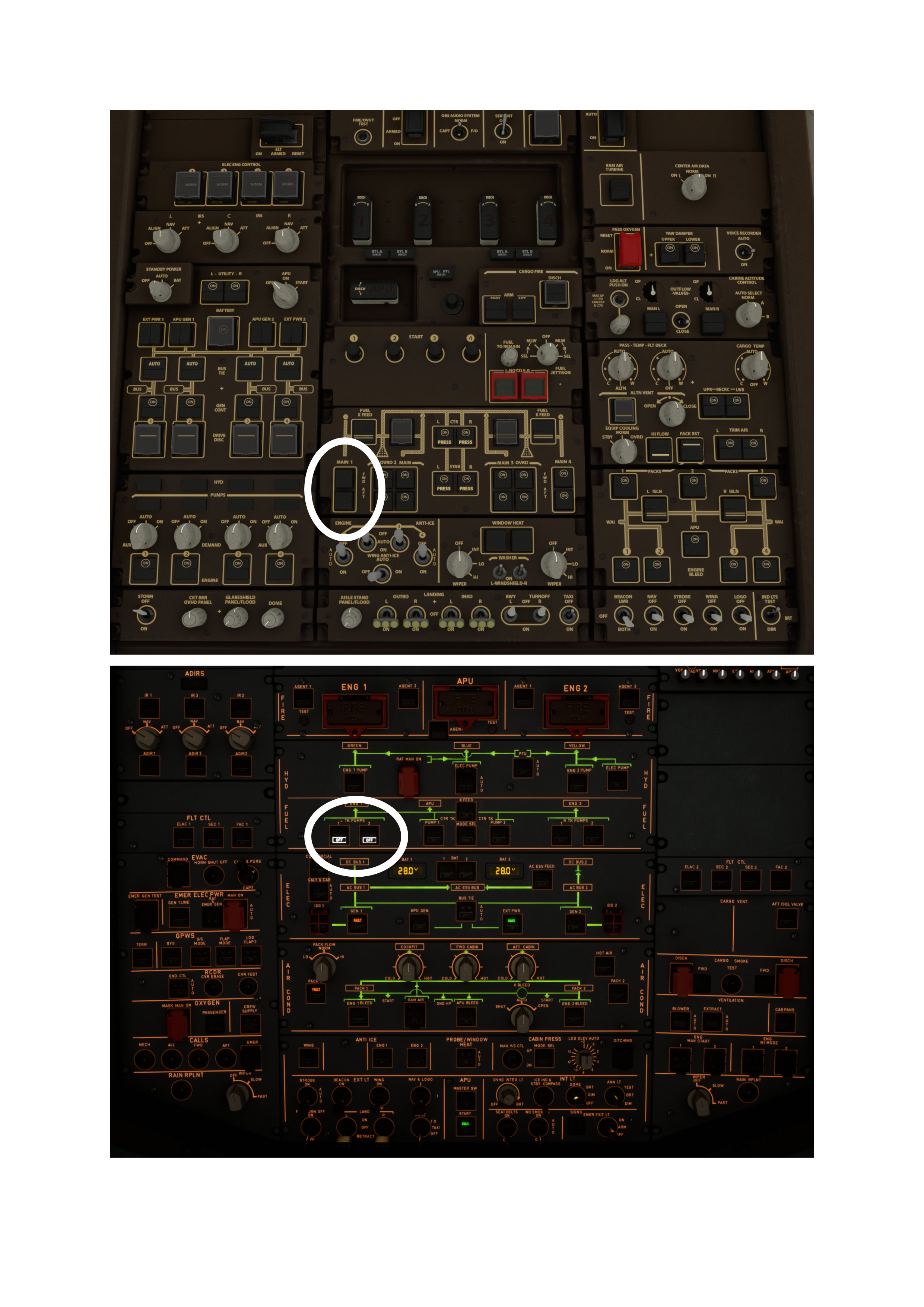
First, let’s look at some cockpit switches from the other big name in airliner manufacturer—the one everyone’s heard of. I’ve deliberately set some of these switches incorrectly. Can you spot the mistake? Well no, probably not…

Boeing 747 cockpit

Of course a pilot will spot the mistake. But the point is, if they’re already distracted by another failure, then their situational awareness is reduced and they might not spot this.

Now let’s look at a similar invalid switch configuration, but this time in the Airbus cockpit.

Airbus A320neo cockpit

Much more easily noticed: the left “Tank Pumps” are set to OFF, which has also caused “GEN 1” and “PACK 1” to go into “FAULT” because, well, the engine has stopped. (Pilots: you can start reading again now.)

Even if you know nothing about flying this aircraft, you could have a good guess what’s not right. The “Dark Cockpit” principle^3 means that only the abnormal switches are lit up, and anything that’s in its nominal position is “dark.

Problem #2 averted. Airbus pilot now has more situational awareness available for problem #1, whatever that was.

Here are these two opposite approaches shown together, with the relevant incorrect switch settings highlighted on the Boeing and then the Airbus. See how much easier the “Dark Cockpit” principle is.

A320 vs Boeing 747 cockpit

What’s the link to Home Automation?

I hope this has persuaded you really simple changes, like changing a switch, can contribute enormously to usability. We can take those principles and apply them more widely.

In my case I’ve applied the Airbus principles to my home automation control screens. This is because it’s all getting a bit too complicated for people to run the house… It’s OK for me—usually—because I built it. But it’s becoming unintelligible for anyone else.

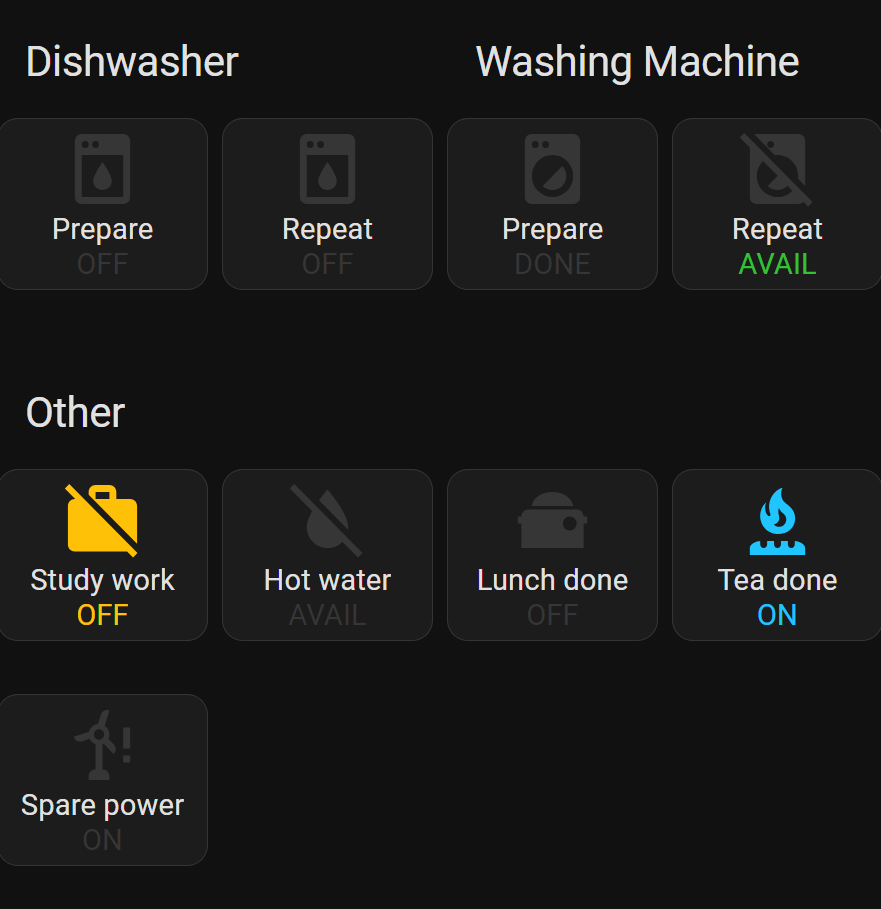
So now, I’ve built a control panel as per Dark Cockpit:

Home Assistant control panel

The Dark Cockpit principle means everything is always dark when it’s “normal”. Only things that require your attention are lit-up, and they follow the same design principles as Airbus too:

Yellow is where you’ve pushed a switch, but “might be of concern, so be aware of it.

Green hints you might want to push that switch, but it’s not essential.

Blue says you’ve pushed a switch, and it will stay activated for a short period until it resets.

Dark is where it’s nominal. E.g. above, the “Spare power” mode is ON, which is the default and therefore is dark.

If I was to push the “Spare power” switch, I’d be disabling spare power (potentially a bad thing) and the button lights up yellow to warn me:

Home Assistant control panel

I’m definitely going to consider this approach when I’m developing software user interfaces, too. Airliner-spec buttons for everyone!

Panel photon pointillism painting

I’ve been doing some painting.

It’s taken 6 months—and an unreasonably broad definition of “painting”—to produce this perfect pointillism…

Lots of coloured dots

I can’t credit myself with any kind of creativity though: my skills in abstract art are absolute zero.

No. It’s a rendering of the skyline behind our house, painted entirely by data from solar panels. No sleight of hand; just natural beauty arising from some chance data.

If you want proof that it’s a painting of a real skyline, skip to the end for the spoiler. Or, read on…

The basics

Obviously, solar panels generate more electricity when there’s more sunlight.

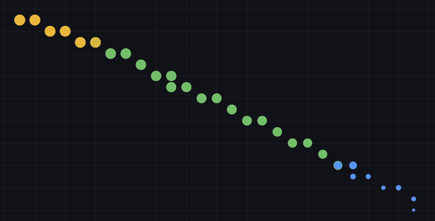
Let’s represent the amount of electricity generated as coloured dots. A large orangey-red dot shows the solar panels are producing lots of electricity, meaning we have lots of sunlight. A small blue dot is less sunlight.

A line of coloured dots from orange to blue

Most solar panels will tell you how much electricity they’re generating. In my case, I measure the electricity generation every 10 seconds or so, and squirrel that data away in case it’s useful later.

It’s about time

As well as measuring how much electricity—and therefore sunlight—I’m recording the date and time of that measurement. If you know where you are on earth, and you know the time, you can calculate the position of the Sun in the sky.

So. Our coloured dots now represent the amount of sunlight, and the position of the Sun.

We can draw that on a graph. Here’s all those dots drawn on the first day of summer.

Arc of coloured dots, orange at the top middle and blue at the tail ends

See how the brightest sunlight is at midday when the Sun is highest in the sky and at “180 degrees Azimuth”—or “South” as normal humans call it.

This should be familiar to most people living in the Northern Hemisphere, where the Sun is always directly South at midday (or maybe 1pm if you’re in BST/DST)

Celestial considerations

Next piece of the painting is that the Sun moves differently across the sky on each day of the year. Northern winter has the Sun tracking much lower across the sky, and higher during summertime. It’s the opposite in the Southern Hemisphere.

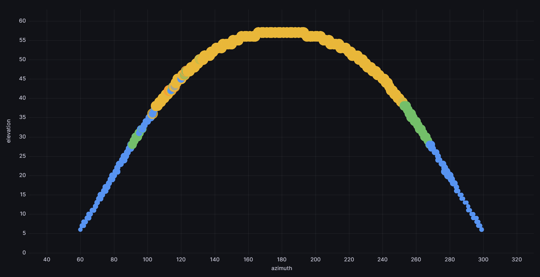
By recording our electricity data for each part of the day, on each day of the year, the data literally paints a picture of how much Sun the solar panels can “see.”

The lowdown

First, for reference, here’s a wide-angle photo of the skyline behind our house. The solar panels are directly behind us in this photo, facing the same direction.

Skyline of back of houses

You can tell this photo is taken from quite low down; our solar panels are mounted on a single-storey garage. It was easier than putting them on the roof of the house, with the trade-off that the Sun often dips below the other houses during winter. No worries: the Sun is always low in the sky during Northern winters, so you don’t get much solar electricity either way.

But: bonus!

The Sun pops in and out of shadow from the surrounding skyline—and the solar panels “see” this as a varying amount of electricity. Our solar panels have become a camera!

Albeit it’s taken 9 months to take 1 exposure.

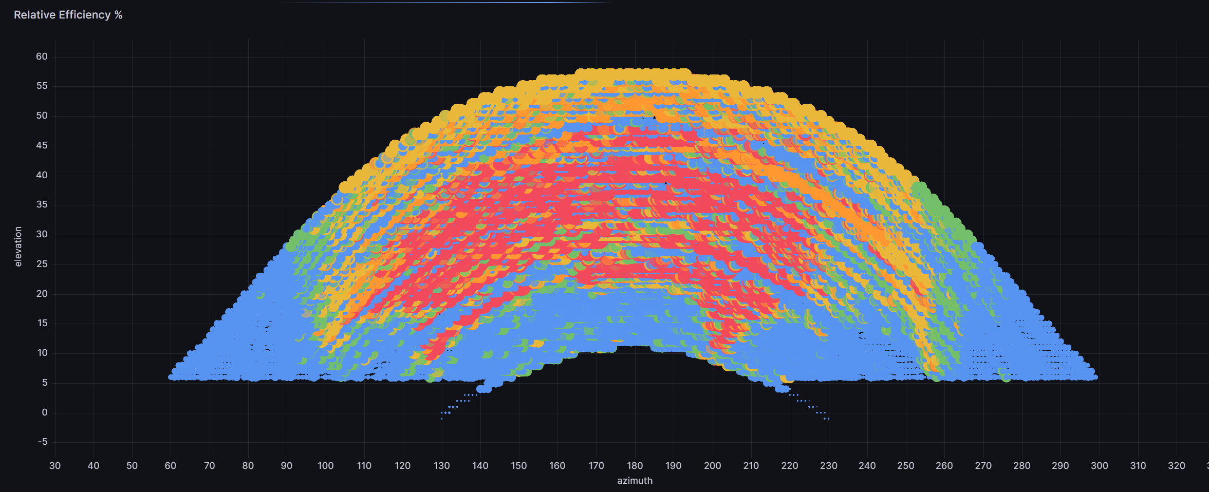
Before the final reveal, here’s the data plot of that 9 months of sunlight strength as seen by the solar panels:

Lots of coloured dots showing Sun position over 9 months

The final picture

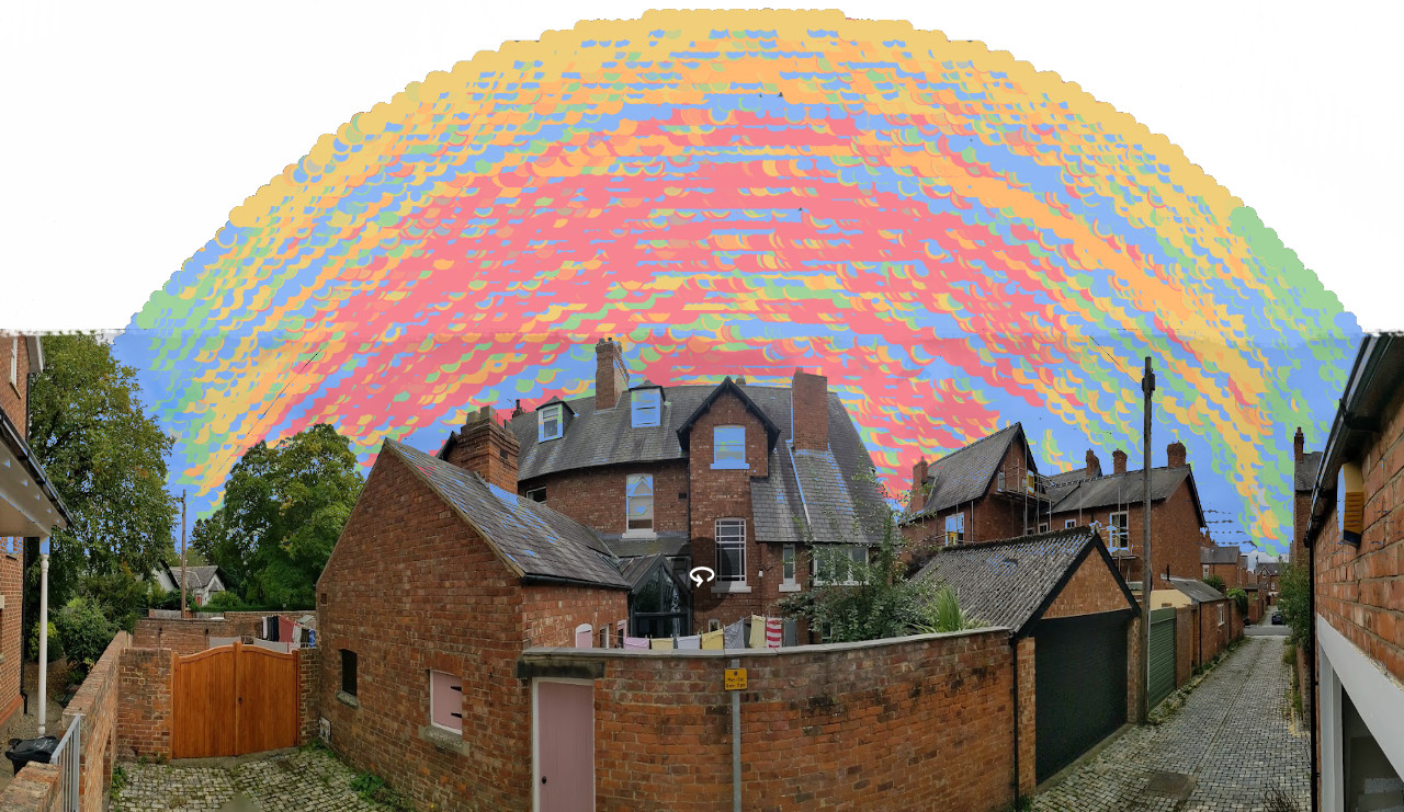
And the final proof that data is beautiful: when laid onto the wide-angle photo, the data has traced the outline of the houses in remarkable detail.

Skyline photo overlayed with dots

It’s striking how the “V” shape gap between the houses is strongly coloured red where the Sun pops through. Conversely the blue shadow cast by the large lime tree on the left of the picture.

Likewise looking right down the back lane, there’s a vertical sliver of yellow as the Sun briefly comes out from one row of houses, before being hidden by the next row just off-camera to the right.

So there you go. Some beautiful pointillism arising from a serendipitous set of data. Art from science!

Epilogue

This should look even better once there’s another year of data behind it. Some of the blue streaks represent cloudy days, sometimes several in a row. That’ll average-out with more data, so I’ll post again when that’s done.

And finally, for the tech nerds:

Solar InverterGrafanaInfluxDBHome AssistantMQTTNode-REDRaw data1Raw data2Aggregated data3Aggregated data4Processed data5Long-term data6Solar InverterGrafanaInfluxDBHome AssistantMQTTNode-RED
dark
sans